Brand redesign for Channel 5

Channel 5’s new brand redesign did a rare thing, made me smile. I’m not saying I don’t smile much (other people’s views may vary) but in terms of design it’s an increasingly rare thing these days. But the above playful little animation did just that. In fact the new branding seems a real shift for […]
Uber logo and branding receives a nip, tuck and refinement

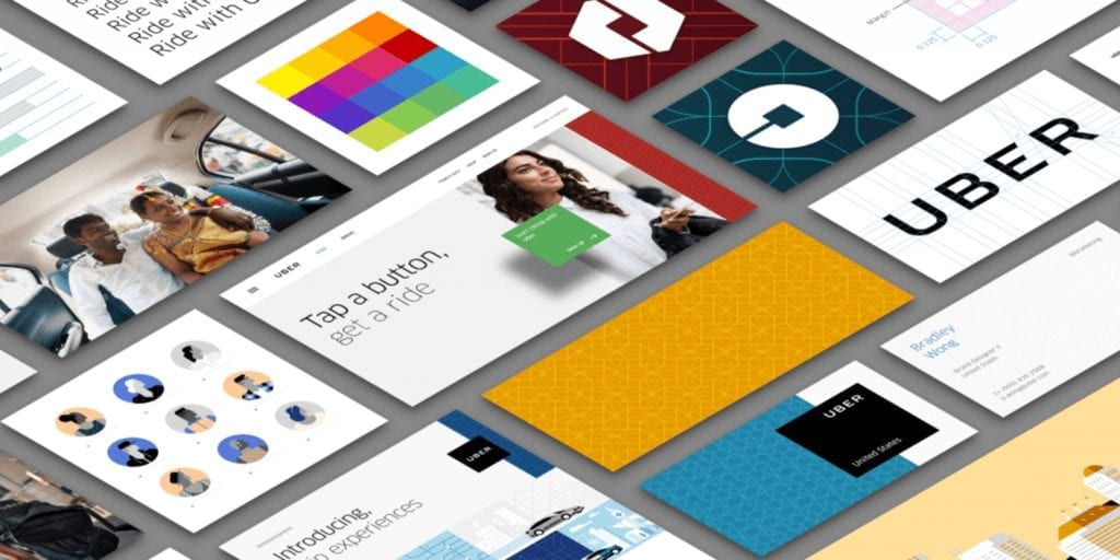
New year and a new look for the Uber logo. Their main logo receives a nick and tuck, with spacing reduced, letters thickened and refined. Bringing the letters closer together and thickening them up makes complete sense, it means it’s more easily read and identified at smaller sizes. “The first thing you’ll notice is that our […]
Enel has a powerful new company identity
Rome based energy company Enel have just unveiled their new company identity, branding and website created by Wolff Olins. The new identity uses cursors to communicate energy movements. Whilst this works very in animated form it’s less successful in static logo form, always difficult to convey movement in logo without moving parts. Overall it works well, and when the identity translates to […]
Nando’s new global rebrand
New global rebrand for Nandos sees a move away from the slightly rustic looking logo and supporting branding and a move to creating “a modern South African” look. “There is a huge emotional connection with the brand and the logo wasn’t really broken, so we’ve refined it, simplified it and made it part of a larger system,” […]
Folk New Brand Identity – Endless Combinations
As identity design goes this is quite a radical new logo for Folk. It works like a fruit machine with lots of different combinations, with an ever changing logo as the result. The colours are obviously very in your face, it would seem inspired by pop art and 8 bit video game culture. The design really does set […]
‘Experience Amazing’: Intel Rebrand
This is an interesting example of ‘branding’ and ‘a brand’ not being about a logo. Intel have been around for almost 50 years and have chosen to highlight the experience side of what they do with a new campaign “Experience Amazing.” The video above focuses on those experiences that Intel have made happen via their technology.
New Logo Design and Identity for thyssenkrupp
When two companies merge sometimes the resulting new logo design can be somewhat difficult. Dixon Carphone anyone? I’m guessing that in many cases trying to marry up design styles and keep both clients happy that there’s an equal balance, which can be tricky. The new logo for thyssenkrupp had to merge Thyssen with Krupp. From viewing their previous […]
New Silversea Identity Design by The Partners
Gorgeous identity design work from The Partners for Silversea. Great use of black and white photography with splashes of red typography. Particularly like the way the type interacts and sits with the imagery. It’s very classic in style, it could have been created at any point in the last 40 years and will stand the test […]
Best logo redesigns of 2015
As high-profile logo and identity design goes, 2015 was a mixed year. There were some big successes with a further increase in ‘flat’ and simplified logos such like Google and Netflix leading the pack. The minimalist stripped down look is definitely here to stay with no doubt more appearing over the coming year.
Historic fine art + corporate logo design mashup
What happens when you mashup some of the classics of the fine art world and the well-known corporate logos of our time? Some might say you’d have some of the fine art masters turning in their graves, others that the juxtaposition brings about some interesting outcomes. I’d say the latter, there’s some striking end results […]

