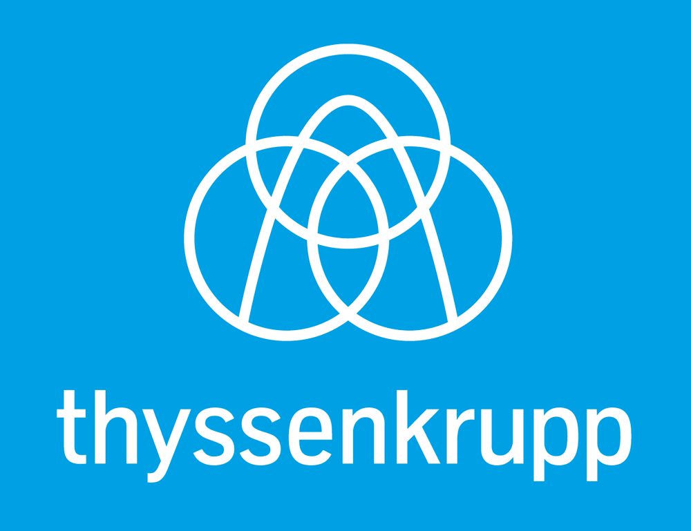
New Logo Design and Identity for thyssenkrupp
When two companies merge sometimes the resulting new logo design can be somewhat difficult. Dixon Carphone anyone? I’m guessing that in many cases trying to marry up design styles and keep both clients happy that there’s an equal balance, which can be tricky.
The new logo for thyssenkrupp had to merge Thyssen with Krupp. From viewing their previous logos below you can see where the outcome has come from. It’s a good marriage of the two, bringing both up to date and creating a unified logo. The white out of the blue works well, it’s a clean, timeless design solution but fits in with a current flat design trend that looks set to last.
“The new logo’s minimal approach is fitting for the times, dropping extraneous graphic baggage picked up during the late 1990s and early 2000s. The drawing is simple and to the point, yielding a space-age-like symbol that looks like serious engineering stuff takes place there. The wordmark uses a lighter version (or maybe a custom modification for this use) of its proprietary typeface, TKType, designed by Dalton Maag in 1999.
Find out more about this project over at www.underconsideration.com
Tags:
Related Posts
OurNet Identity Design
Couple of months ago we had the pleasure of working with social network ‘OurNet’ to create a new …
Uber logo and branding receives a nip, tuck and refinement
New year and a new look for the Uber logo. Their main logo receives a nick and tuck, with …
New website and identity design for Green Man Festival
A refreshingly fun new identity design and website for the Wales based GreenMan Festival has surfaced. Strange characters …
Nonô – the gift of identity design
Nice little story and identity design here. One of the partners at Pentagram gave the owner of a …
Brand evolution for Alaska Airlines
Like many of the large airlines, ‘Alaska’ has recently opted for a refinement of its existing identity and …
Utopia 2016 – identity design with smileys
In terms of design this new identity design for Somerset House’s ‘Utopia 2016’ is quite bold move. It features …
“All-seeing owl” – new brand identity for SearchFlow
New identity for SearchFlow sees the use of an illustrated owl with magnifying glasses for eyes, reflecting the …
Folk New Brand Identity – Endless Combinations
As identity design goes this is quite a radical new logo for Folk. It works like a fruit machine with lots …
Google X Has a New Logo
Is it just me or does ‘Google X’ sound like a replacement for Spectre, or some another top …
New Silversea Identity Design by The Partners
Gorgeous identity design work from The Partners for Silversea. Great use of black and white photography with splashes of …
Recent Posts
Categories
- 3D Printing
- Advertising
- Apple
- Art
- Branding
- Branding and Logo Design
- Business
- Design in General
- Design Process
- Events
- Facebook Marketing
- Film
- Flyer Design
- Identity / Logo Design
- Illustration
- Internet
- Marketing
- Music
- Other
- Packaging Design
- Photography
- Print Design
- Random
- SEO
- Social Media
- Street Art
- Technology
- TV Advertising
- Typography
- Uncategorized
- Website Design
- WordPress