New global rebrand for Nandos sees a move away from the slightly rustic looking logo and supporting branding and a move to creating “a modern South African” look.
“There is a huge emotional connection with the brand and the logo wasn’t really broken, so we’ve refined it, simplified it and made it part of a larger system,” says Rautenbach, who adds: “The heart has been made more generous, the wordmark has been modernised and smoothed and the leaves which were visual baggage have been dropped.”
No massive change with the actual logo itself as mentioned, it’s a little cleaner and the texture has been removed and lines simplified and cleaned up.

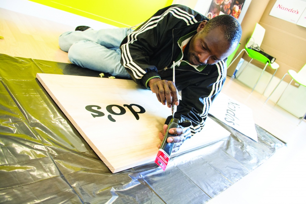
One of the great touches is a custom “Nando’s Hand” font
“Sign writer and artist Marks Salimu has created the “Nando’s Hand” font, which has been created by hand painting onto wooden panels and digitising the letterforms that have been created.” “He’s an amazing artist in his own right; working with people like Marks gives the brand a humanity and a humility.”

One of the interesting parts of this rebrand is the colour work. They decided that the red of the Nandos logo and across the branding was slightly changed to a new custom “PERi Red Pantone” which was colour-matched to an African bird’s eye chilli.
“Colour specialist Manie Pieterson visited chilli fields in Mozambique to colour swatch various shades before settling on Pantone 1797.”

Overall no great shakes but more of a slight repositioning and update.of the global chicken restaurant brand.


