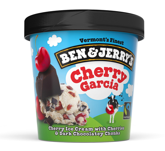
Even very successful brands like Ben & Jerry’s need to constantly keep their brand fresh and improve product clarity among increasing competition. The new ‘refresh’ of the whole Ben & Jerry’s packaging range looks to be a great move, retaining and simplifying the blue cloudy sky and green hills, placing the product flavour name within the cloud as a consistent holding device.
The designers behind this refresh, PearlFisher said that challenge was to “revamp the Ben & Jerry’s packaging portfolio, elevating the premium quality of the product depiction and refining the architecture without abandoning the principles that are at the heart of the brand.”
One of the features they haven’t abandoned is the element of fun, with the signature cow character taking more of a centre stage appearance, interacting with an ingredient or idea from each product name.
Have to say they have the balance perfect and even manage to showcase the ingredients in an original and novel way, with a graphic device called the ‘Flavor towers’ which can be seen below.

This video best tells the story of the strip down and simplification of this global ice-cream brand…
More detail and further analysis of the redesign can be found over at BrandNew

Maximising Online Growth with Pay Per Click Services in Devon
In the digital world, visibility is key. That’s where pay per click (PPC) services come in. They’re a powerful tool


