Just one Cornetto, give it to me

“Just one Cornetto, give it to me, delicious ice cream, of Italy…” showing my age there, but I think I’ll forever associate Cornetto with that song! Cornetto has just refreshed their packs and branding in time for summer and looking pretty delicious they are too. A much more stripped down cleaner affair with simplified logotype […]
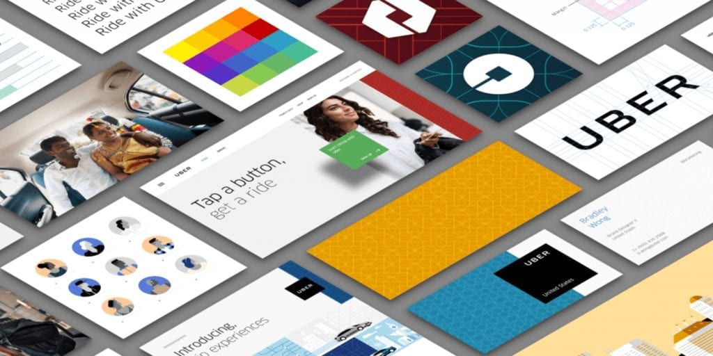
Uber logo and branding receives a nip, tuck and refinement

New year and a new look for the Uber logo. Their main logo receives a nick and tuck, with spacing reduced, letters thickened and refined. Bringing the letters closer together and thickening them up makes complete sense, it means it’s more easily read and identified at smaller sizes. “The first thing you’ll notice is that our […]
Brand evolution for Alaska Airlines
Like many of the large airlines, ‘Alaska’ has recently opted for a refinement of its existing identity and branding rather than a completely new concept. Deciding to build on what they have with this brand evolution is a smart move as they are one of the lesser known airlines operating around the world. The designer […]
‘Experience Amazing’: Intel Rebrand
This is an interesting example of ‘branding’ and ‘a brand’ not being about a logo. Intel have been around for almost 50 years and have chosen to highlight the experience side of what they do with a new campaign “Experience Amazing.” The video above focuses on those experiences that Intel have made happen via their technology.
ITV – new logo design in detail
ITV’s rebrand is one of the better I’ve seen recently. In terms of capturing the right tone and summing up what they offer as a broadcaster, it’s right on the money in my opinion. So this post over at LogoDesignLove which details the process that the design team went through is of great interest. The use […]

