There are a fair few theories and stories surrounding why a symbol of a bitten apple was used for the Apple logo design.
Ranging from it being a tribute to Alan Turing the man who created the foundation of the modern computer so a reference to a computing term ‘byte’. Or when the same man rumoured to have bit into an apple he had laced with cyanide in order to commit suicide.
As well as is being reference to the bible when Eve took a bite out of the forbidden fruit it’s also been linked Sir Isaac.
Turns out none of this is true.
Over at Creative Bits Rob Janoff the man who created the Apple logo design gives an interview that takes through the real story.
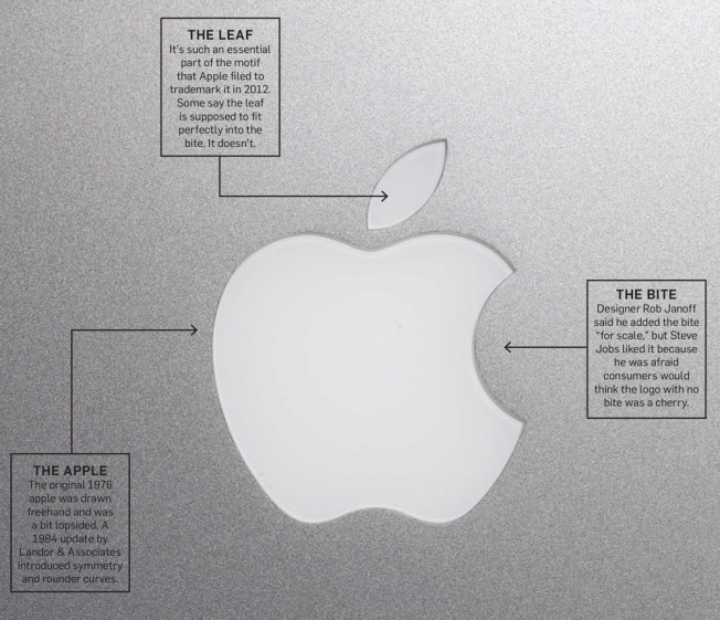
“We presented two versions of the logo. One with and one without the bite. Just in case he thought the bite was too cute. Fortunately he went with the one that gave it the most personality with the bite. Frankly it was a no brainer and you would miss the mark if you don’t show some kind of an apple.”

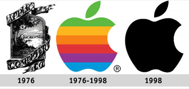
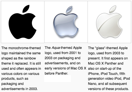
The logo design underwent some tweaks and changes later mainly to fit in with trends and newer mac computer models but overall has stayed the same throughout it’s life.

“I think it’s very important that a company like Apple keep very up-to-date and Steve Jobs is obviously very conscious of that and he has fabulous designers working for him in industrial design and graphic design. I feel great that it’s still the same basic silhouette even though it went through lots and lots of changes.”
So we’ve established that there’s no real meaning behind the Apple logo, in fact when Janoff is asked if he got a brief from Steve Jobs he says “Really there was no brief. But the really funny thing was the only direction we got from Steve Jobs is: “don’t make it cute”.”
The logo was refreshed and slightly redraw by Landor over time starting in the early 80’s. Janoff:“They brightened the colors, they made the shapes much more symmetrical, much more geometric. When I designed it I pretty much did it freehand”
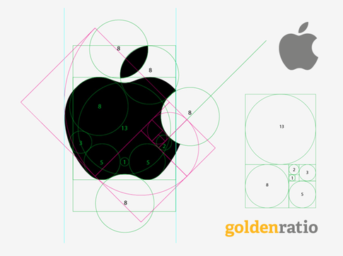
When reading about Apple’s logo it hard to not come across stories about Golden Ratio and how the logo fits into this, though it’s close and it might even have been used in part it doesn’t really work as David Cole Director of Design at Quora explains

It’s a little disappointing that there isn’t any real solid meaning behind the Apple logo, it seems it was just a name liked by the founders at the time with the designer being given free rein and never really attaching anything behind it.
That said there’s no doubt the Apple logo is now an icon of design, this in part to the success of the company, the iPhone itself and it’s overall product design.

Maximising Online Growth with Pay Per Click Services in Devon
In the digital world, visibility is key. That’s where pay per click (PPC) services come in. They’re a powerful tool


