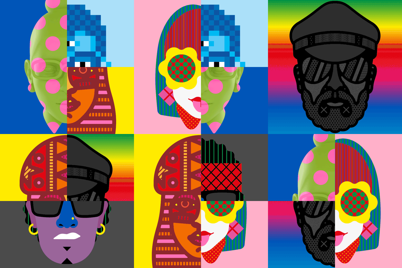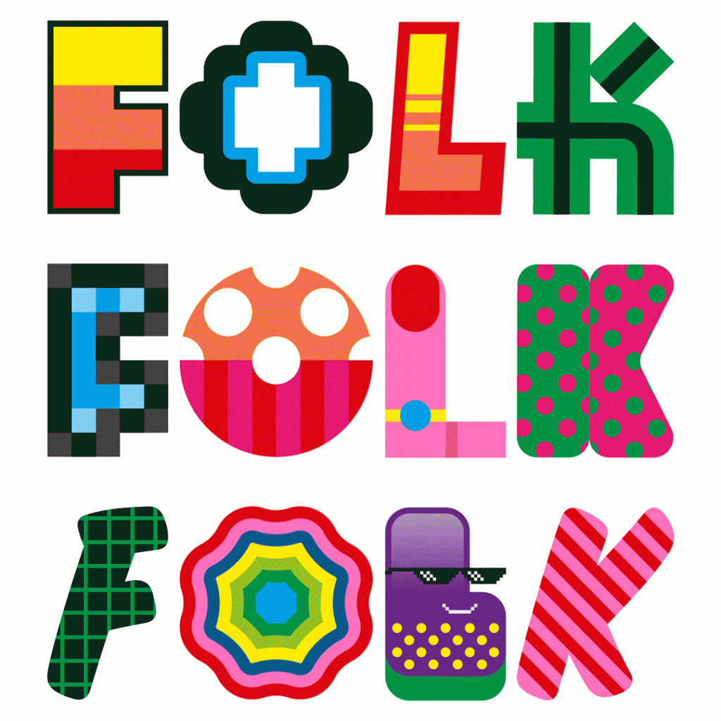
As identity design goes this is quite a radical new logo for Folk. It works like a fruit machine with lots of different combinations, with an ever changing logo as the result. The colours are obviously very in your face, it would seem inspired by pop art and 8 bit video game culture. The design really does set themselves apart from most other companies operating in the media arena.
I really do like how different and unfashionable this is compared to other new identities around at the moment. Fun is turned up to 11 here with explosions and characters, resulting in a very memorable design.
“Inspired by the pace of digital technology’s constant evolution, graphic artists Craig & Karl created a fun, whimsical visual identity for Folk , a Finnish content funding platform. Using mismatched letters , their fun, eye-catching visual identity spins like a slot machine revealing countless permutations.”


