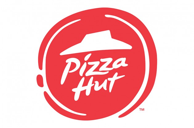
“The new logo design aims for the stripped back approach” Source: www.creativebloq.com
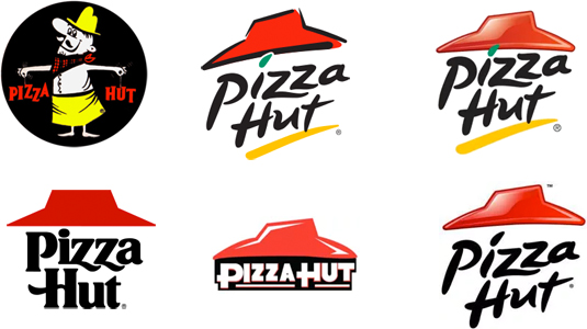
Certainly an improvement on the past identities for this purveyor of Pizza, which made it look down market and in some cases damn right cheap. Not really the values that Pizza Hut is keen to communicate I’m sure.

Apparently the rebrand “move comes after Pizza Hut reported sales drops for the last eight quarters while such rivals as Domino’s and Papa John’s post better performances.”
The new logo design is following the trend for a simpler, cleaner more stripped down look in the vein of Ebay, Google, MSN, Netflix.
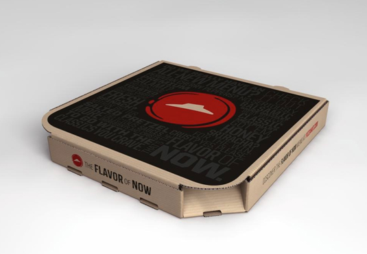
In terms of the look I like the fact the logo design is both in the shape of the initial tomato sauce ‘swirl’ that goes on to pizza and also seems to hint at some sort of wax seal of quality at the same time. The application of the logo (see pizza box below) certainly suggests a bigger move to a more ‘quality’ feel to set Pizza Hut further apart from the takeaway pizza chains and independents that are up and down the country and likely the world.

Time will tell whether this rebrand will help boosts Pizza Hut’s falling profits in the US. Alongside the rebrand they seem to be taking no chances with the addition of a new motto: “The Flavor of Now.” Whilst also adding several new and ‘radical’ options to their menus. New offering such as ‘Old Fashioned Meatbrawl’, ‘Pretzel Piggy’ and ‘Cherry Pepper Bombshell’.

Maximising Online Growth with Pay Per Click Services in Devon
In the digital world, visibility is key. That’s where pay per click (PPC) services come in. They’re a powerful tool


