Starbucks have just revealed their new brand identity, showing a simplified, ‘less is more’ approach.
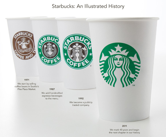
They have removed the name and any reference to ‘coffee’ altogether and refined the ‘Siren’ choosing to place her in green on white.
This is quite a step and change for a brand of this size, removing the name alone is a bold move and one that must have been carefully considered. As you can see from the ‘Illustrated History’ below this change from the design in ’92 to today is very different.
At first I was unsure about it, has the removal of so much weakened the identity, diluted it?
Only time will tell, but its certainly a big move for the company and one that won’t go unnoticed both in the design community and on the high street.

Here’s what Starbucks had to say over on Starbuck blog:
“When we first heard about the possibility of modifying the Starbucks brand identity, our minds went wild with the possibilities. This was the project of a lifetime. The designers here at Starbucks have such a love for this brand – it’s what drives our creativity.
From the start, we wanted to recognize and honor the important equities of the iconic Starbucks logo. So we broke down the four main parts of the mark – color, shape, typeface and the Siren. After hundreds of explorations, we found the answer in simplicity. Removing the words from the mark, bringing in the green, and taking the Siren out of her ring. For forty years she’s represented coffee, and now she is the star. ”
You can read more about the design process and thinking behind the work over at the Starbucks site.
So what do you think?
Less is more or is this a step too far, can we expect a ‘Gap’ like outcry?


