A few weeks ago, a brand new chicken shop in Cardiff ruffled a few feathers when it unveiled it’s new logo (pictured below).
However, since the food company has also gone on to produce posters (below) telling customers to “eat cock”, “touch my breast” and “touch my thigh” we’re not so sure that the owner Neil Young and his designers actually did have a clean, wholesome image in mind.

But when it comes to branding, marketing experts across the world will agree that good logo design is essential. After all, logos serve as an instant reminder of who you are and what you represent.
When it comes to logos there’s no one thing that makes it instantly bad, of course triple checking that the logo doesn’t look like something else should be your top priority because if it does resemble something that can be misconstrued then you can bet your last pound that that’s how you’ll be remembered.
Here are a few other tips on avoiding logo disaster…
Typeface: We are just going to tell you straight, if you use comic sans, papyrus or curlz as the typeface for your logo then you don’t deserve to be in business. These typefaces may be fine for exchanging little notes with your mates but they have no place in business, they scream unprofessional.
Clip Art: Clip art needs to be avoided at all costs. It’s not going to give out a unique image of your company – not to mention the quality of the majority of clip art is shockingly poor.
Don’t make it too complicated: For every amazing logo there’s a company that takes it too far. Logos that go down that over complicated road look terrible on signage – take the original Starbucks logo for example…

Don’t copy: Just because your logo is the same as Pepsi (for example), it doesn’t mean you’ll be as successful. In fact people will probably just refer to you as “that company that uses a logo that looks like Pepsi”, As hard as it may be, try and do something original.
So want to see some examples of poor logos? Well you’ve come to the right place. In order to try and steer you away from making a logo disaster yourself, we’ve compiled some top logo #FAILS from across the globe…
Doughboys

There’s a bit of theme when it comes to phallic logo fails. Doughboys also tried to make “d” and “b” go together with disastrous effects. Seriously, how does that logo make you want to chow down on a panini?
The Catholic Church

You may think we’re joking with this one but it’s an actual logo that was designed in 1973 (before the rumours obviously) for the Catholic Church’s Archdiocesan Youth Commission. It even won an award!
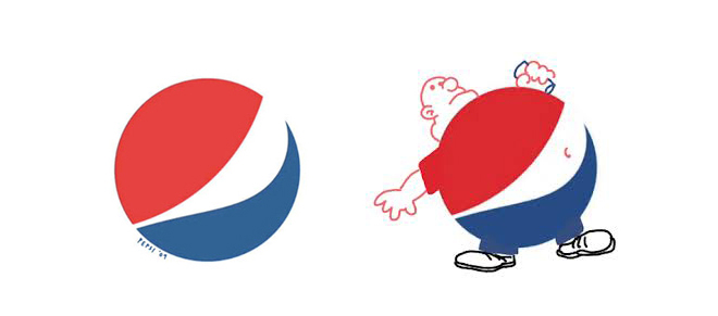
Pepsi

I will never look at Pepsi in the same way again. Apparently, the logo – whilst being world famous – actually is just a depiction of what you’ll look like if you keep downing masses of the fizzy drink.
Megaflicks

What did we tell you about typefaces? Choosing the wrong one could seriously mess up your logo.
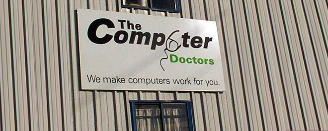
The Computer Doctors

We don’t need to explain just why this is an epic fail. Can you imagine the hands (no pun intended) this logo went through and yet they still continued to use it and even enlarged it (again…no pun here) for their sign. This is one doctor we don’t need to see.
Seriously, we could go on. Next time you’re browsing the web or out and about on your local high street, look around you, you’ll see plenty of examples of poorly thought out logo design.
Remember that logos are there to have an immediate impact, to keep your company in the mind of potential users and to represent your business. Just because you’ve managed to capture attention due to a hidden penis or a strikingly bad typeface, it doesn’t mean that you’re doing well!
Why not share examples of logos you’ve been shocked by with us on Twitter.


