Back in the summer of last year I had the pleasure of meeting Neil Pie a freelance PHP Programmer and after some time and a…
![]()
Back in the summer of last year I had the pleasure of meeting Neil Pie a freelance PHP Programmer and after some time and a few discussions back and forth I was asked to work on his company logo design.
This identity required a slightly different approach to many that I work on as he wanted a more hand-drawn and alternative feel. Also it needed a visual reference to the ‘Pie’ part of his name. Requirements were also that it communicated an unstuffy, slightly playful and relaxed feel that didn’t take its self too seriously.
Based on the verbal brief and ideas that Neil wanted to be explored I looked at 3 initial design concepts pictured below.
——————————————————————————————————————–
Initial Logo Design Concept No: 1
Focusing on the ‘Pie’ element of Neil’s name (as he wanted to highlight this in some way),
I hand drew the typography and a simple pie shape. In addition brainstormed several different
strap-lines, settling on “As easy as Pie” to get the ball rolling, as this seemed to fit with the playful, slightly tongue in cheek feel to the whole identity.
![]()
Initial Logo Design Concept No: 2
This logo design concept was a little more serious in tone but still using hand-drawn typography and icons. The idea was to try and get across Neil’s computer-based profession by using the computer cursor but at the same time almost suggesting it was a section of Pie.
![]()
Initial Logo Design Concept No: 3
Again this logo design was hand-drawn and I played down the pie element using it on a smaller scale and more subtly as the dot of the ‘i’. This (if it had been selected) could have been used as graphic element or a pointer within future promotional material such as brochure or other print/web design work. The emphasis of this logo design was more on the name itself using chunky capitals and think lines.
![]()
——————————————————————————————————————–
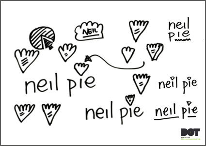
Part of the design process involved me sketching lots of elements and the words needed within the logo, any that I felt were working were then scanned in and traced/redrawn in illustrator ready to be used in the initial designs.
A few of the sketches are shown below as an example of this, there are many more I haven’t shown here…
![]()
![]()
After a discussion with Neil and time for him to look through, digest and think about the initial concepts that were presented, a preference for Logo Design Concept No: 2 was established.
Neil felt that he wanted to explore this idea but maybe making it more sketchy as if there had been underlying plans or drafts to the idea.
This was looked at along with slightly different ways of drawing the elements also with different colour options and adding the possible tag on word relating to the service of “PHP and “SEO”. The pictures below show some of the development work sheets with small adjustments and tweeks that were undertaken on the journey to the final logo design.
![]()
![]()
![]()
![]()
![]()
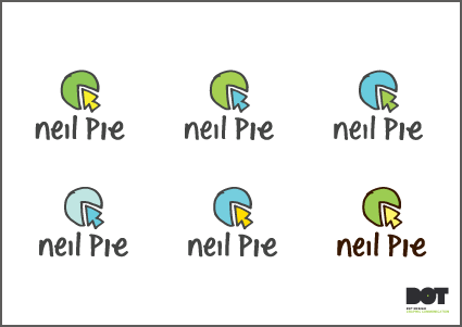
After further feedback and several email/phone sessions, a final logo was arrived at.
——————————————————————————————————————–
Final Logo Design
![]()
It was a refreshing and really enjoyable experience to work on this project as its not often I get to use hand-drawn elements within the whole of a logo design solution.
I hope you have found this insight into one of my recent design projects interesting. I will be posting other projects from abit of a backlog over the next few weeks/months.
If you have any questions or comments please do feel free to post them below or email me at:
gareth@dot-design.co.uk and I’ll answer them as quickly as possible.
Ready to Chat?
Book a free 15-minute call and let’s talk about growing your business.
Book a Free Call