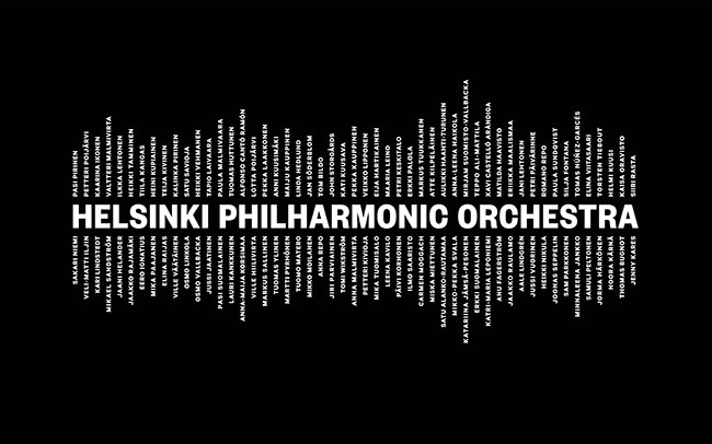
This work by Bond caught my eye over at logodesignlove a very simple but effective piece of design. Usually alot of detail in a logo design is a big ‘no no’ but here there are several versions the logo. The main one incorporates the names of those in the orchestra and another uses simple lines, such as in the business card design below.
“Helsinki Philharmonic Orchestra wanted to reposition its brand in order to strengthen the brand image and overall experience. In a series of workshops the new positioning and identity was crystallised; the power and energy of the music is the orchestra’s driving force. The new visual identity brings alive Helsinki Philharmonic Orchestra’s core, all 102 musicians, in both logo and photographic concept.”


