Like many of the large airlines, ‘Alaska’ has recently opted for a refinement of its existing identity and branding rather than a completely new concept. Deciding to build on what they have with this brand evolution is a smart move as they are one of the lesser known airlines operating around the world.
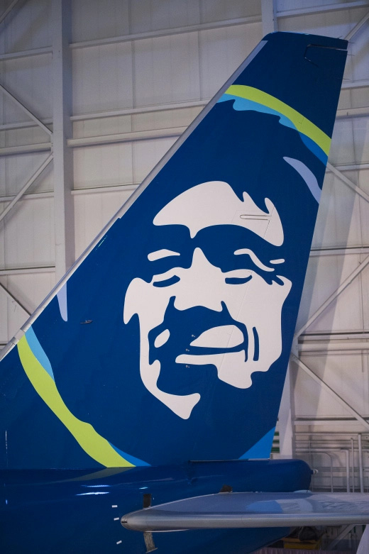
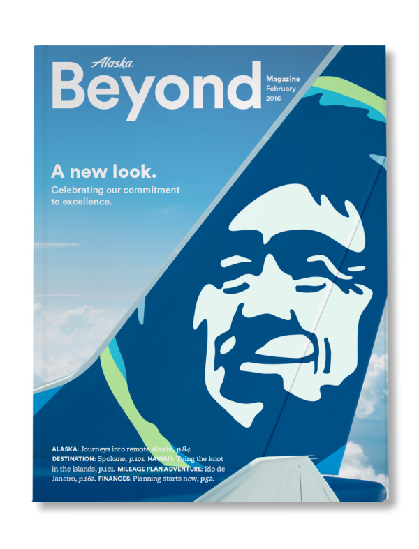
The designer opted to smooth out and simplify the rough lines of the previous logo and the Eskimo face illustration that features on their planes tail and other materials.

So nothing radical or very exciting here but a solid move to further establishing the identity and Alaska Airlines brand.
The colours work well on the livery, with the dark blue on the white giving good contrast, but splashes of green and lighter cyan adding more visual interest and freshening the look.

Overall a clean, friendly look is achieved…
“Our refreshed brand really is an evolution, not a revolution, of Alaska Airlines,” said Sangita Woerner, the airline’s vice president of marketing. “Our goal was to reflect the soul of our company, which is known for its genuine, caring service and top-notch performance. It’s now time to show up to our customers in a bigger, brighter way.”

Find out more over at www.underconsideration.com also check out this microsite dedicated to the redesign


