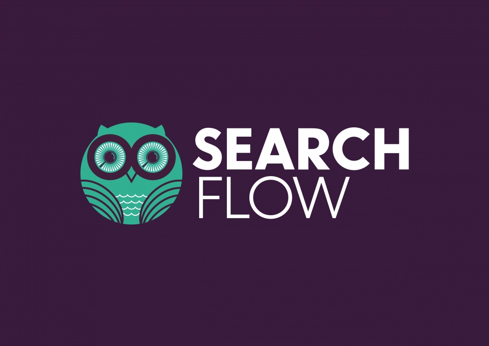
New identity for SearchFlow sees the use of an illustrated owl with magnifying glasses for eyes, reflecting the nature of their business.
SearchFlow is the market-leading provider of conveyancing search solutions.
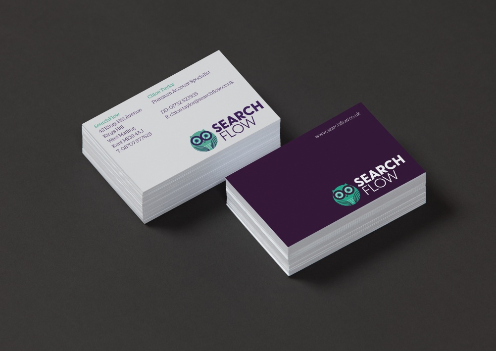
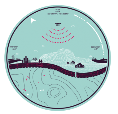
I really do like this brand identity solution and the fun had with the owl icon which seems to be slightly adapted to be used through out marketing material, as seen below.

“An owl with magnifying lenses for eyes has been used as a metaphor for the business, given its ability to “skillfully scan the landscape using its acute binocular vision”, according to Industry partner Sholto Lindsay-Smith.
The landscape is reflected in the owl’s wings and an aubergine, teal and white colour palette has been chosen in favour of a corporate navy blue and orange, which was found in the old logo.”
The colour palette is slightly unusual for this business sector, but works well at setting them apart and building brand recognition in the market. The owl could work really well animated in a video or tv advert, with possibly the eye/magnify glasses spinning around and the small gold circles rotating.
Overall a smart and memorable brand identity, works really well and should quickly get recognition in the market it’s in.
Find out more about this brand identity over at www.designweek.co.uk


