So another year comes to a close and BrandNew have published their now traditional ‘The Best and Worst Identities of 2014’
In which (as the name suggests) they highlight the Best and the Worse of Identity design, all in their opinion of course, but they are usually pretty spot on.
Overall I agree with most of the selection of the good and the, ahem, not so good (to put it politely). Here’s a selection of some of our favourites of the year…
Glenfiddich
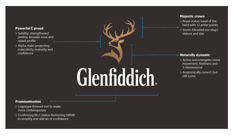
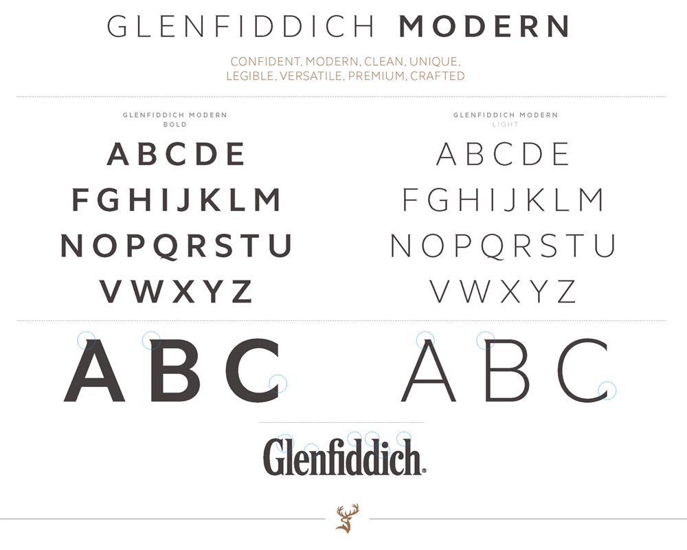
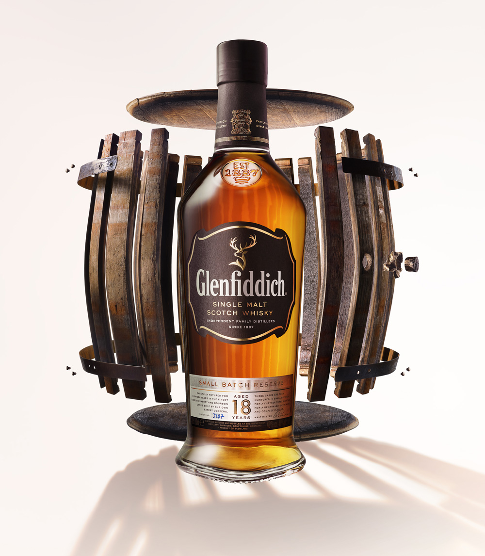
One of my overall favourite brand evolution’s of the year was the New Logo, Identity and Packaging for Glenfiddich by Purple this work is as solid as they come. The designers involved could quite easily have destroyed the brand value that’s been built up if the refresh had been too heavy-handed. Instead they’ve really captured the sense of tradition, mood, built on what’s there already, refining and crafting a contemporary look, that retains the heritage.
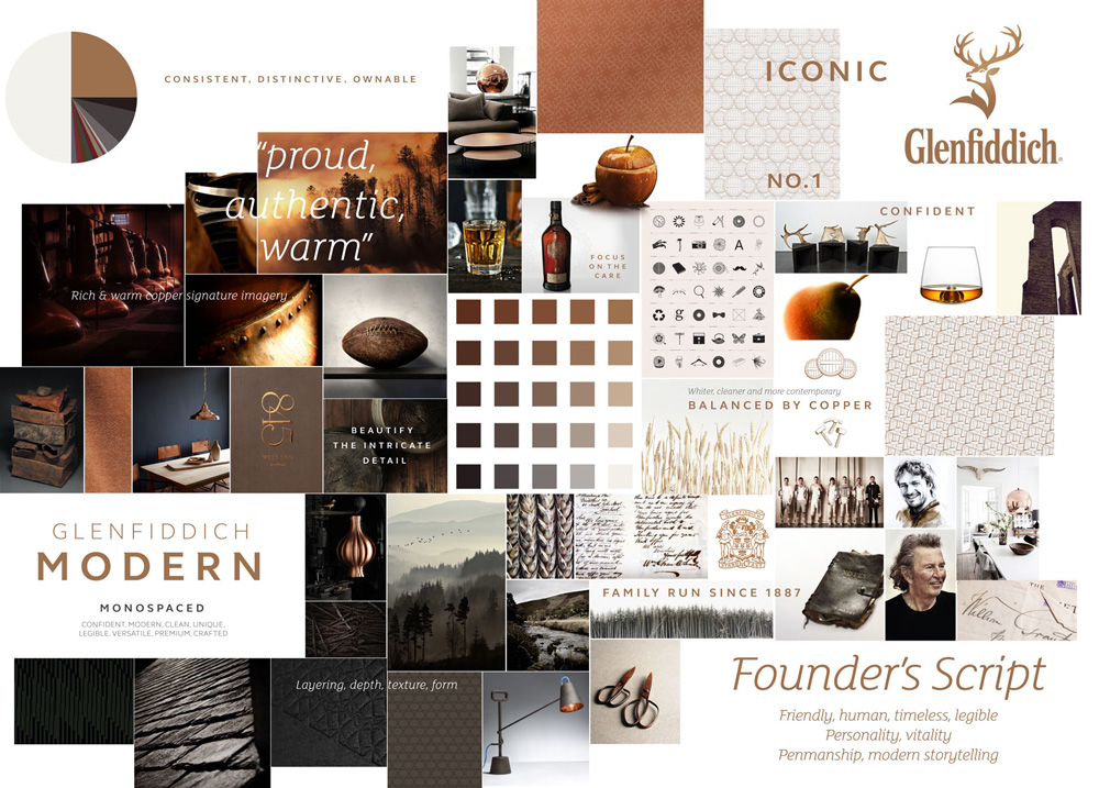
The colour palette is bold but expresses, taste, quality and warmth one would associate with the Glenfiddich brand.
As you can see from the boards below, it all fits perfectly and although there’s no huge shift in the design, the enhancements have been carried out well and tastefully.

Airbnb
Another identity project that has grown on me since it was unveiled back in July of this year is the Airbnb rebrand.
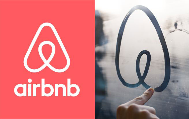
When news of it broke on the internet and social media it was widely critised for it’s similarity to some other identity designs and it’s apparent phallic appearance…
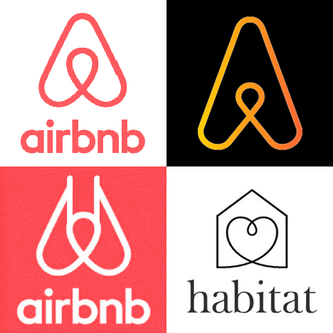
In hindsight this criticism was alittle unfair, yes there are some similarities but not enough to say that it had been plagiarised, basically it’s a looped design to create a shape or symbol. Overall I think it works well when rolled out over the whole of their branded materials, but I’d question it’s overuse of the word ‘belonging’ it doesn’t seem to fit for me.
Porto
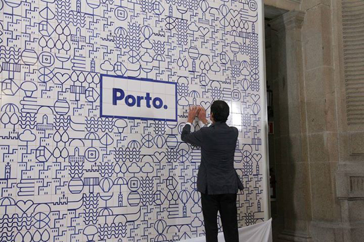
Another very successful identity design for me in 2014 was this work for the city of Porto in Portugal.

Though very simple on first viewing the identity comes into its own on the supporting materials, with a use of icons to create very distinctive patterns.
![]()
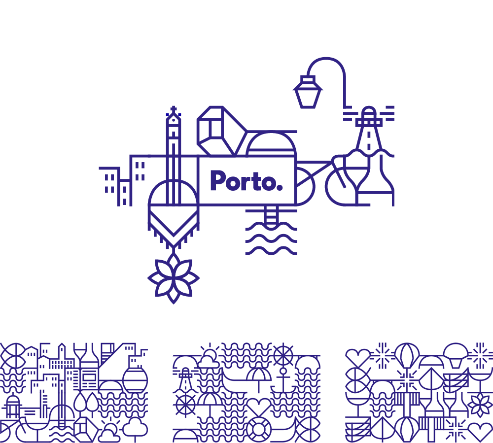
It manages to be both contemporary and reflect a the existing blue tiles that are spread all across the city, the icon system highlighting what the city has to offer visitors.
Open Knowledge Foundation
We covered this identity design work by Johnson Banks earlier in 2014 but it deserves another mention as I think it’s a great example of meaningful design.
Open Knowledge animation from johnson banks on Vimeo.
The logo is certainly ‘Open’ as “The identity is supplied as a “kit of parts” to the organisation’s working groups and global members, according to Johnson.
He says that it uses as many open-source elements as possible, including the free typeface Lato, designed by Lukasz Dziedzic for the tyPoland foundry.”
The Primal Kitchen
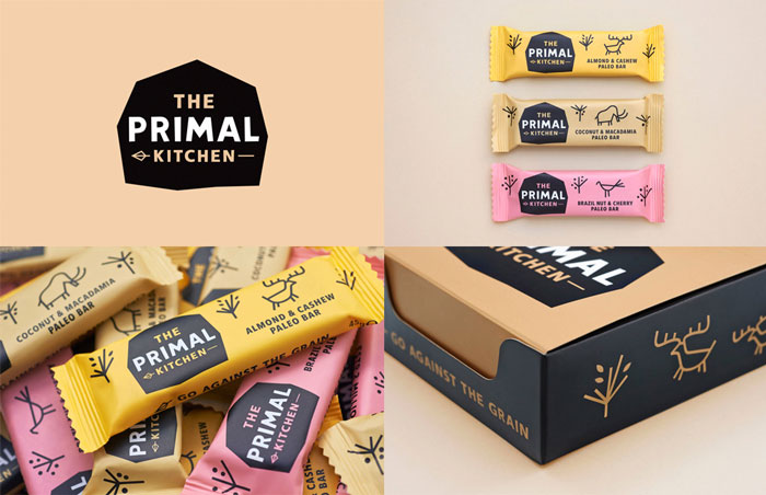
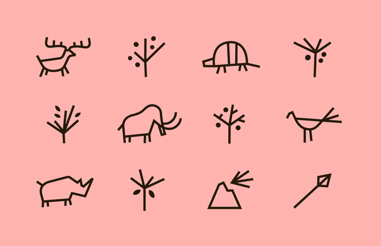
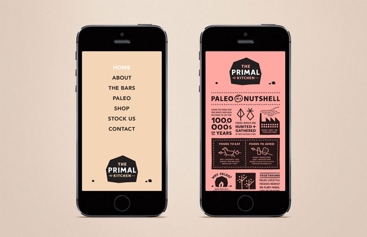
The branding and packaging for these energy bars also caught our attention. The colour palette is gorgeous and usual for this sector but works brilliantly. We love the cave drawing line work and the identity works well, very playful and tongue in cheek, but grownup as well. The product itself (grain and fruit based bars) reflects the ‘hunter gatherer’ theme of the branding perfectly.
All great projects in our view, but what were you favourite identity design projects of 2014, be sure to let us know below…


