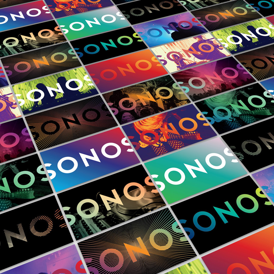
I’m a huge fan of SONOS products, they are well designed, produce excellent sound quality and they just work in the simplest way possible. As well as this they’ve really got their identity design and branding spot on in my opinion.
From the palindrome name, distinctive clean type and strong use of image and colour it all aligns with the music industry they are in but in a cool almost Apple like way.
The name works really well on these cards (below) as a repeated line across bright contrasting club imagery.

The logo itself hasn’t been updated just the materials it sits on, this is a good thing as it requires no changes and I believe it will stand the test of time.
See the article over at UnderConsideration for more details on how this look was rolled out of other materials.

Maximising Online Growth with Pay Per Click Services in Devon
In the digital world, visibility is key. That’s where pay per click (PPC) services come in. They’re a powerful tool


