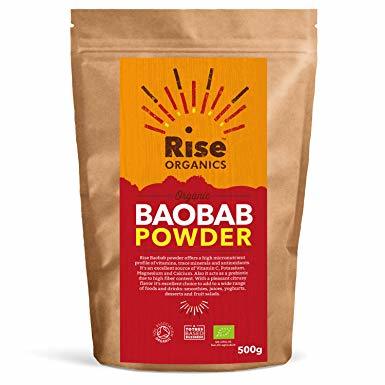
We created the branding and identity design for ‘Rise Organics’ with a rustic and lively theme required for the paper-lined foil pouches. It was important to communicate the nature of the products as well as build a visual theme around them.
Create a lively and authentic brand that emphasises the features, ingredients, benefits and lifestyle feel of Rise Organics. Strong use of texture, colour and typography to be used throughout.
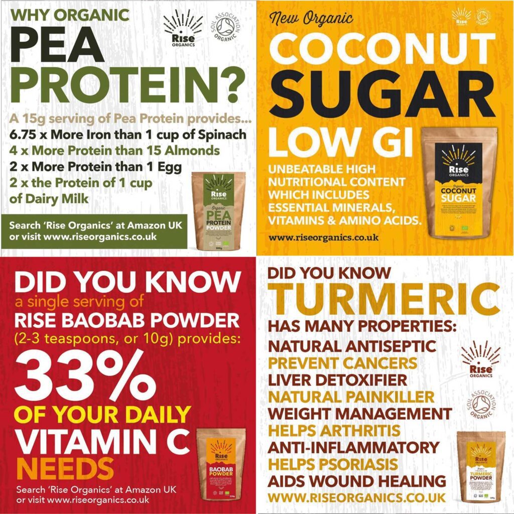
Creation of visual assets for a Social Media campaign to launch new product lines and increase sales. These draw on the prominent brands colours for each product and used a rustic, organic feel to enhance the branding.
Pack label designs, featuring strong colours and typography. Front features name of product, short intro and back features nutritional breakdown.
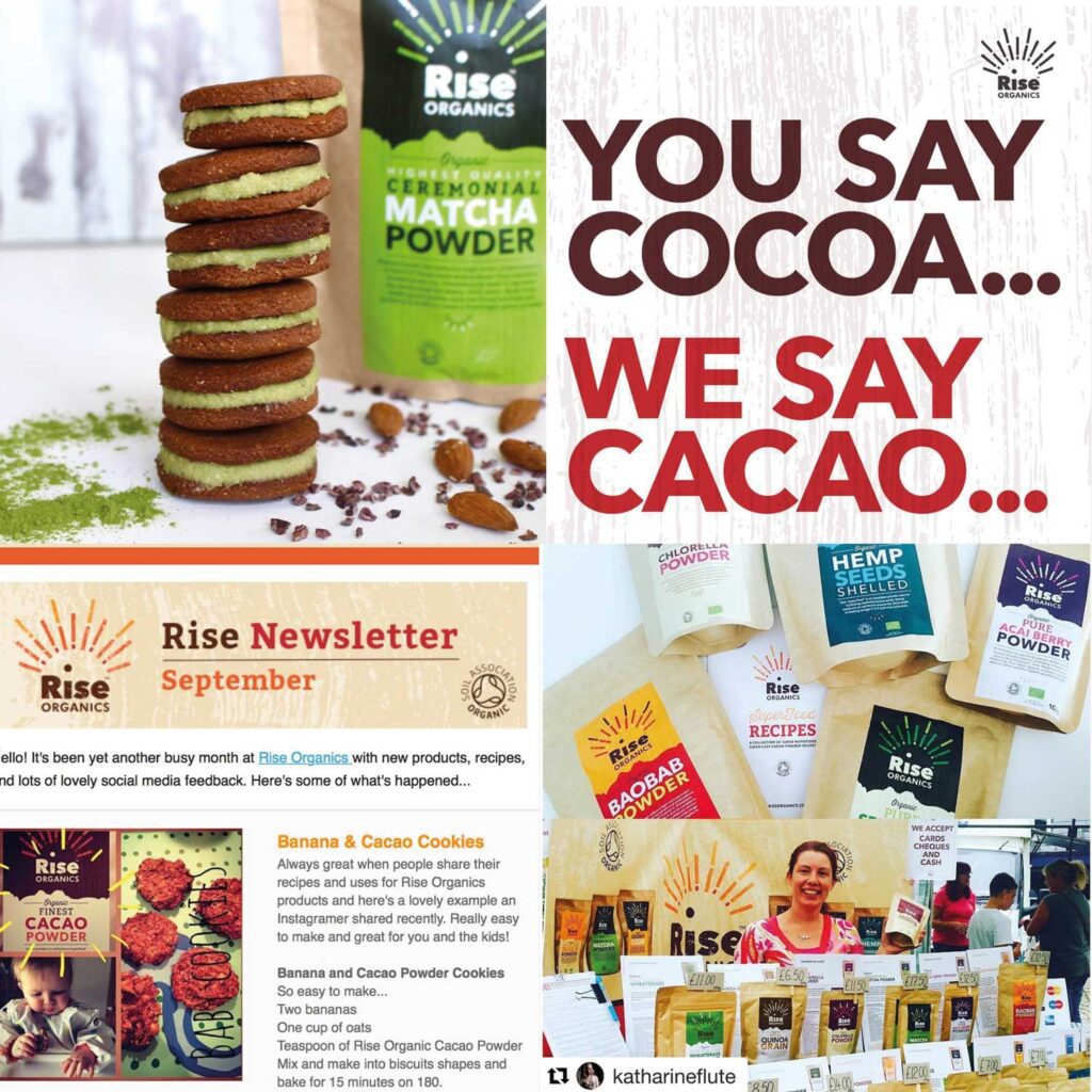
We helped advise Rise Organics on Social Media campaign, physical pop up stall look
and feel and details around display and presentation of products.
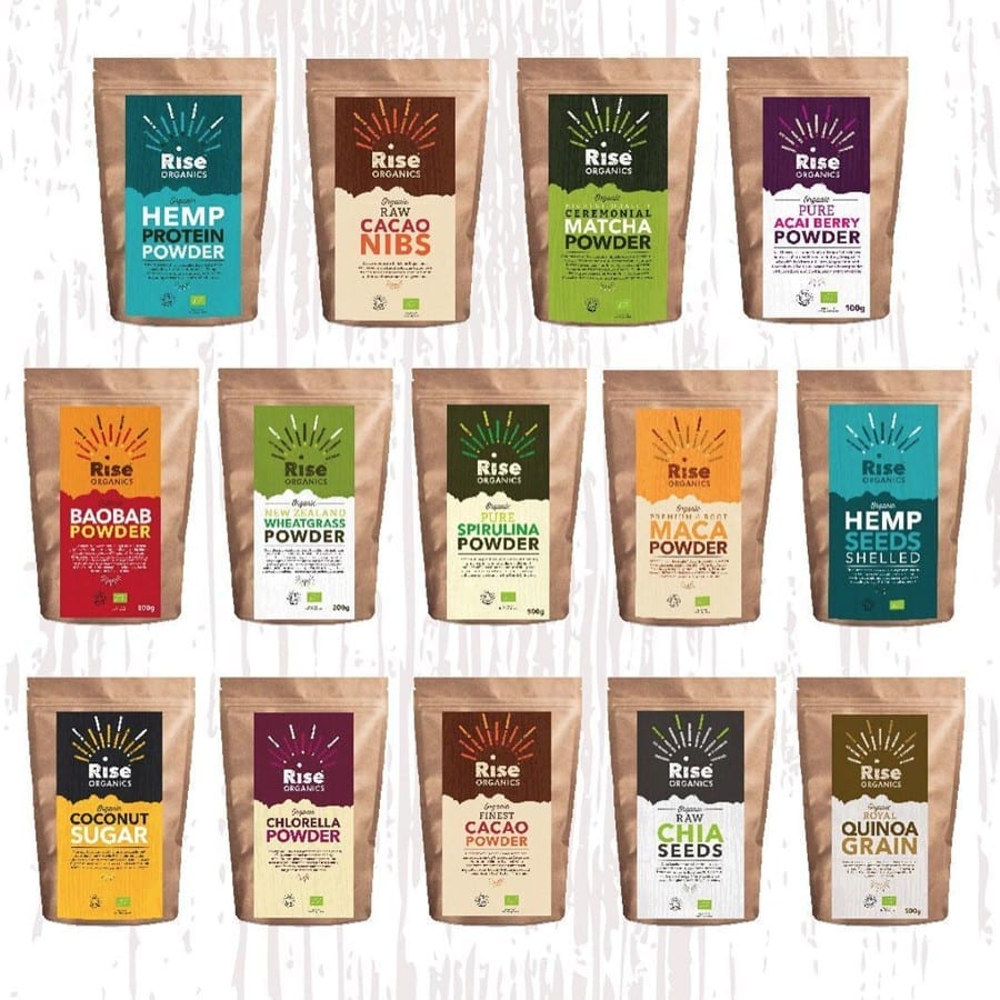
Colour coded and individual pack labels were created for the packs, reinforcing the branding and style of the Rise Core feel.
The shelves in our supermarkets, farm shops and even virtual shelves on Amazon have become a battleground. One where the balance of product/produce quality, pack design and branding are equally important. A really well-designed pack can be the difference between a product flourishing and a product becoming past its best before date.
We are drawn to products that look great and despite what some may say, we mostly buy with our eyes. A well-designed pack will always win over a poorly communicated design. The importance of packaging design cannot be understated. As well as providing a vessel for the product to be housed it, it now goes further and reinforces brand message and ethos.
We will have a chat through your business, opportunites that are relevant and how we might be able to help. No sales pitches, pressure or nonsense just a 15 minute overview of where you are.