Oscars new brand identity design
The Oscar statuette is one of the most recognisable icons in the world, but many people may be less familiar with the branding of the Academy of Motion Picture Arts and Sciences, or at least the designs they have used in the past.
This may be the reasoning behind the Academy introducing a new brand identity design on December 12th, which has already been met with acclaim. The Academy hopes that the new design will focus attention on the work of the organisation, such as in the fields of creative arts and sciences, rather than on their annual awards ceremony which attracts some of Hollywood’s biggest players.
The specifics of the new logo
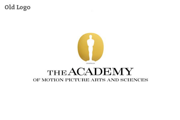
The old Academy logo featured a silhouette of the Oscar statuette on a black background with gold lettering spelling out, “The Oscars”. The font was contemporary and stylish, and was used to advertise the organisation’s annual Academy Awards ceremony, usually held each year in February, and attracting an televised audience of millions.
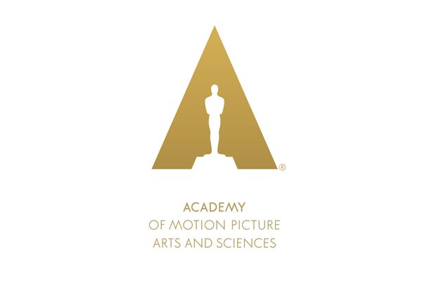
The new logo features a large capitalised ‘A’ which surrounds the silhouette and makes use of a gold and white colour scheme. The new graphic design is much more minimalist than before, although both logos share a similar colour palette and theme. The Academy will use the logo when it announces the names of the nominees for the next Oscar ceremony on January 16th, and again when the awards are broadcast on March 2nd.

Design of the new logo
Christina Kounelias, the Academy’s marketing chief, explained why the organisation changed their corporate identity. She noted how the Academy wanted a design that reflected their community of artists, the creative processes they employ and their diverse talents, and to bring all of these ideas into one single vision.
The idea to change the visual identity of the Oscar brand started two years ago, when the organisation wanted a fresh design that reflected the Academy as a whole, and the wider work that it does rather than just the glitz and glamour of the Hollywood movie industry.
Kounelias went on to say that the brand new logo places the Oscar statuette in a spotlight and a triangular shape is created with the statuette forming an ‘A’ shape to stand for Academy. As the organisation supports a number of creative sciences and arts throughout the year, the new logo had to reflect this.
Does the new logo represent the ethos of the Academy?
On first glance, you will notice that the new logo has been scaled back. The design is confident in its approach, and contains no words like the previous one did, almost as if to say the Oscar statuette is so recognisable, the wider public will instantly recognise what the new logo symbolises. The silhouette forming an A is a clever touch, and the use of the gold and white colouring indicates glamour and prestige.
The new logo is far less busy than the previous one and the new simple design works well.
Whether the Oscar silhouette is as recognisable to the general public as the Academy thinks it is will remain to be seen, especially among international audiences. For those who are unfamiliar with the brand, the presence of no text and such a simplified design may cause confusion.
Can the new logo be scaled down for other purposes?
The new logo has already been successfully scaled down and is currently being used as a favicon on the Academy’s website (Oscars.org).
The gold triangular design looks good in the interface of any web browser, especially as gold is an infrequently used colour when it comes to favicon design. However, the white silhouette of the Oscar statuette is hard to make out, making this logo look much better when it is presented on a larger scale.
The thought process behind the new design
The Academy is still big business, and is as popular and relevant as ever. The annual Oscar ceremony proves a big draw for television network ABC, who broadcast the awards as well as a red-carpet “pre-show” prior to the main event.
The Academy also have big plans for the future, including the opening of a new museum in 2017. Their new logo was designed with the help of Los Angeles design agency 180LA, whose previous clients include Sony, Adidas, Expedia and Pepsi. The company originated in Amsterdam, Netherlands, before opening their second office in California.


