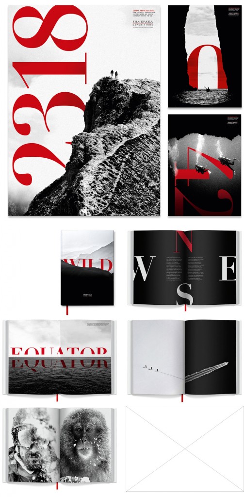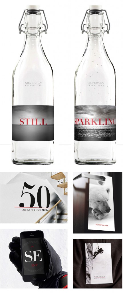
Gorgeous identity design work from The Partners for Silversea. Great use of black and white photography with splashes of red typography. Particularly like the way the type interacts and sits with the imagery. It’s very classic in style, it could have been created at any point in the last 40 years and will stand the test of time for the next 40 no doubt.
“At the heart of the visual identity was a striking approach to photography, inspired by old Italian cinematography This creates an evocative and authentic representation of the expedition experience and helps potential guests to imagine themselves on board ship,
An elegant Italian serif font was given a leading role to place the brand’s heritage centre stage. The bold and playful interaction of type with photography reflects the dramatic nature of the expedition experiences. Over the last year, Silversea has been implementing a new identity — the logo remains the same — designed by London-based The Partners.”


