A few months ago I was contacted by Simon Bunker at Samba Consulting to design a logo for his new Book Review Blog ‘Blogging Bookworm’ which by the way I’d highly recommend to check out! Here’s is some more information about the Bloggin Bookworm…
…a self confessed book worm with a passion for reading and reviewing books and the guy behind the Blogging Book Worm. I started this blog project following a challenge that I set myself early this year to read a book every fortnight. The key purpose of this blog is provide reviews of the books that I have read during my challenge and to also encourage people to start reading books and to provide a platform so that they can post book reviews. Yes, this blog is very much about building a community of people interested in reading books.
Before I start a new identity / logo design project I send through a questionnaire to the clients which helps me to get under the skin of the business and find out more about how what its audience is, how it markets and positions itself and general how it ticks.
In this case Simon was unsure of what he required initially so I came up with some concepts to get the ball rolling and give an idea of possible solutions and directions. These mostly focused more around the ‘book’ theme rather than ‘worm’ theme as this seemed more appropriate given the main type of audience that would be reading the blog and also the choice of books that had already been reviewed.
See below for a brief look through some of process and conclusion to this logo design project.
——————————————————————————————————————————-————
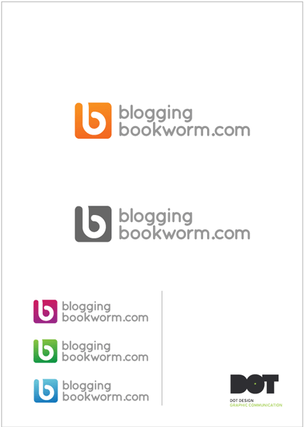
Initial Logo Design Concept No: 1
This logo focused on the idea of a worm tunnelling and creating a loose ‘b’ shape out of the negative space left behind.
Rather than being literal this was more of a nod to the ‘worm’ theme and used made use of more contemporary colours rather than a more obvious earth-toned palette such as browns etc.
A rounded sans serif font was used to visually link the typography with the rounded square icon.

——————————————————————————————————————————-————
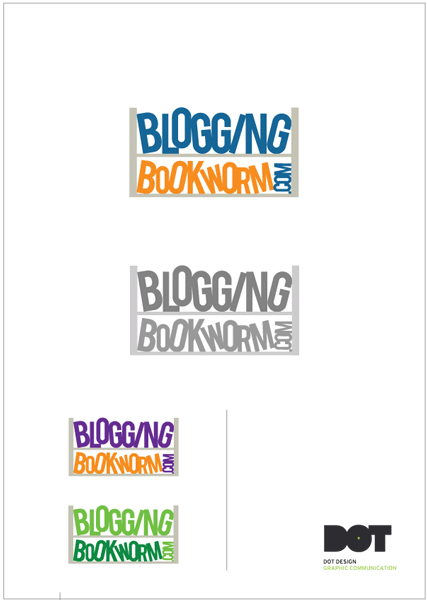
Initial Logo Design Concept No: 2
This concept focused solely on the ‘book’ theme and the idea of books stacked randomly on a shelf, with the letterforms representing books themselves. The bookcase lines made the logo work more as a unit that could be easily applied to other items such as future merchandise.

——————————————————————————————————————————-————
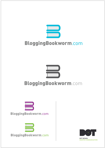
Initial Logo Design Concept No: 3
Again focusing solely on the obvious ‘book’ theme I looked at stacks of books and how these could be arranged to simply form the initial ‘B’. Always looking for the simplest way to communicate an idea or theme. Two books placed on top of each other were used to form a ‘B’ as shown below.

——————————————————————————————————————————-————
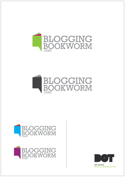
Initial Logo Design Concept No: 4
This logo design looked at the idea of comments and discussion usually found in the blogging world. The idea of a book/speech bubble seemed an ideal way of simply communicating that simply and effectively.
I’ve also included a few of the rough sketch’s and thumbnails I produced before arriving at the 4 concepts above. You’ll have to excuse the rough nature of these as they are more a ‘get it down on paper’ process rather than any thought as to how they might look visually to an audience.
They also don’t illustrate the full process as the were a number of ‘working’ sheets produced on the mac.


After presenting these 4 initial concepts to Simon at ‘Blogging Bookworm’ he chose logo design concept number 2 out right and said there was no need for any further exploration of the design process as this really stood out for him as an identity to sat well with what he wanted for the blog and its audience.
Nicked named ‘The Jiggly Books’ by Simon himself, you can now see this logo being used on the Blogging Bookworm
——————————————————————————————————————————-————
Final Logo Design


