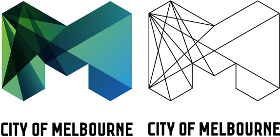
Logo Design – City of Melbourne
City of Melbourne has been given a $240,000 facelift with this new logo and branding.
Recently unveiled this logo replaces the previous with a large ‘M’ cross sectioned by lines that create a kind of diamond/glass like structure.
“The ‘M’ design will become an icon for Melbourne, synonymous with the modern, vibrant, cool city Melbourne is today and will continue to be in the future.
“The new identity will deliver more impact, be stronger, more flexible and reduce confusion as to who is delivering services. It will build greater long term identification and align with best practice around the world.”
“The new brand is strong and leading edge and will be instantly recognised as belonging to the City of Melbourne.”
Lord Mayor Robert Doyle also said
the old logo was “a bit daggy” and Melbourne needed a new design to reflect its cool sophistication on the world stage.
“The world’s changed, the city of Melbourne has changed, this organisation has changed as well, and we’re now playing far more, not just on the national stage but also on the international stage,” Cr Doyle said.
Initial research for the new brand / logo cost the council $91,000 and the design itself cost $148,000.
But he defended the cost, saying the new logo would save the council money in the long run by gradually replacing about 50 different logos the city now uses for its various services.
Associate Professor Farrelly said Melbourne’s brand had needed refreshing and the cost had not been excessive.


