

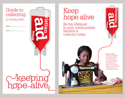
Johnson Banks have designed an excellent print campaign for Christian Aid Week, featuring the identity as a blood bag and creating typography in the form of a line of blood.
This is an excellent and simple design that very clearly and graphically illustrates what Christian Aid is all about, while using contemporary typography and a strong idea. I really like it and I’d be interested to know your views..
← Back to the blog
Christian Aid Logo Design and Print Campaign – by Johnson Banks
Book a call
Let’s get you on the radar.
Book a free 15 minute call. We’ll talk through your business, what’s working, what isn’t, and what would make the biggest difference. No pitch, no pressure.