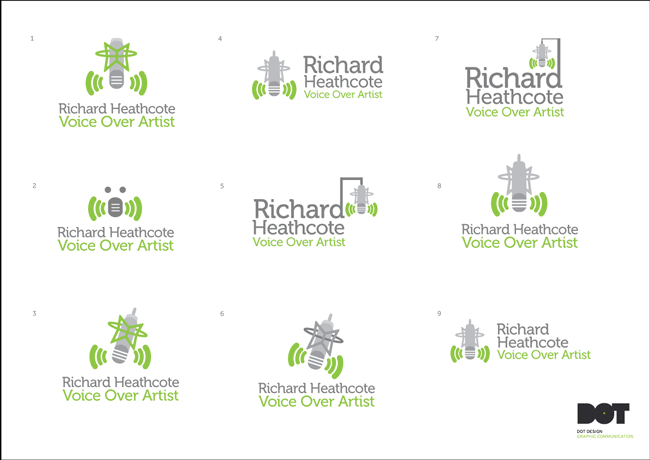
Just before Christmas I had the pleasure of working on Richard Heathcote’s new company logo design.
Richard Heathcote is a well respected Voice Over Artist, you can hear examples of his Voice Over work by clicking here.
Richard wanted a logo that would encapsulate what he does, with possible use of an icon, possibly a microphone/mouth/voice etc.
After speaking with Richard about the direction he wanted his logo design to go in we established that he preferred a certain colour palette. The suggested colour palette was a lime green and possible use of blacks/greys, hence the focus within the initial concepts presented.
I worked on and put forward 4 initial design concepts shown below.
Initial Logo Design Concept No: 1
Focusing on speech/sound and incorporating these two themes into one icon, with a speech bubble and sound waves.

Initial Logo Design Concept No: 2
Again the idea of sound needed to be communicated so this is a running theme throughout the designs I initially put forward. The design below looked at combining the idea of a Megaphone or Loud Hailer as well as sound waves and speech bubble into one graphic.

Initial Logo Design Concept No: 3
Making use of the letter ‘O’ as a point to radiate soundwaves from, again highlighting a key theme of the company.

Initial Logo Design Concept No: 4
Further development of the speech bubble/sound graphic to communicate the overall theme.

Initial Logo Design Concept No: 5
More of a flat graphic version of the previous concept 3, with a focus on a simple sound graphic, with a similarity to the RSS Feed icon as to tie in with the blogging/podcast and general online activities of Richard Heathcote.

Logo Design Development No: 1
After presenting and discussing the above design concepts with Richard it was felt that the hierachy of the company name needed to change with ‘Richard Heathcote’ being above ‘Voice Over Artist’. Also a choice was made to develop concept no: 2 but to work in a microphone and stand into the graphic.
So I then looked at several ways this could be incorporated but still keeping the graphic simple and down to as fewer elements as possible.

Logo Design Development No: 2
Discussing the previous logo developments it was established that the logo needed to illustrate in more detail the exact microphone that Richard mainly used, the tool of his trade if you like.
Taking this on board along with all of the other feedback, I looked at illustrating the specific microphone but in simplified way.

Logo Design Development No: 3
At this stage the overall style was agreed on and then several layouts of typography and placement of graphic were looked at.

Final logo design


Testimonial from Richard Heathcote Voice Over Artist:
“Gareth has just completed my new logo/re-brand, this totally encompasses my initial vision (and developed vision through the developmental process we went through) and resulted in a logo I’m extremely pleased with that says in a nice, simple way exactly what I do. Five Stars for Gareth and Dot Design”


