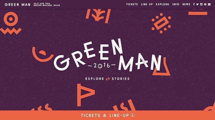
A refreshingly fun new identity design and website for the Wales based GreenMan Festival has surfaced. Strange characters mix well with the ‘jiggly’ letterforms of the identity itself. There’s lots to take in over at their new website. The colour palette is quite unusual but works brilliantly with dotted background patterns and contrasting colours. Simple iconography highlights areas of the festival and mixes well with weird characters that are sure to work well on merchandise and other materials.
It all works very well and offers many surprises and alot of originality for a festival that visually at least is really trying to set itself apart, excellent work.


Maximising Online Growth with Pay Per Click Services in Devon
In the digital world, visibility is key. That’s where pay per click (PPC) services come in. They’re a powerful tool


