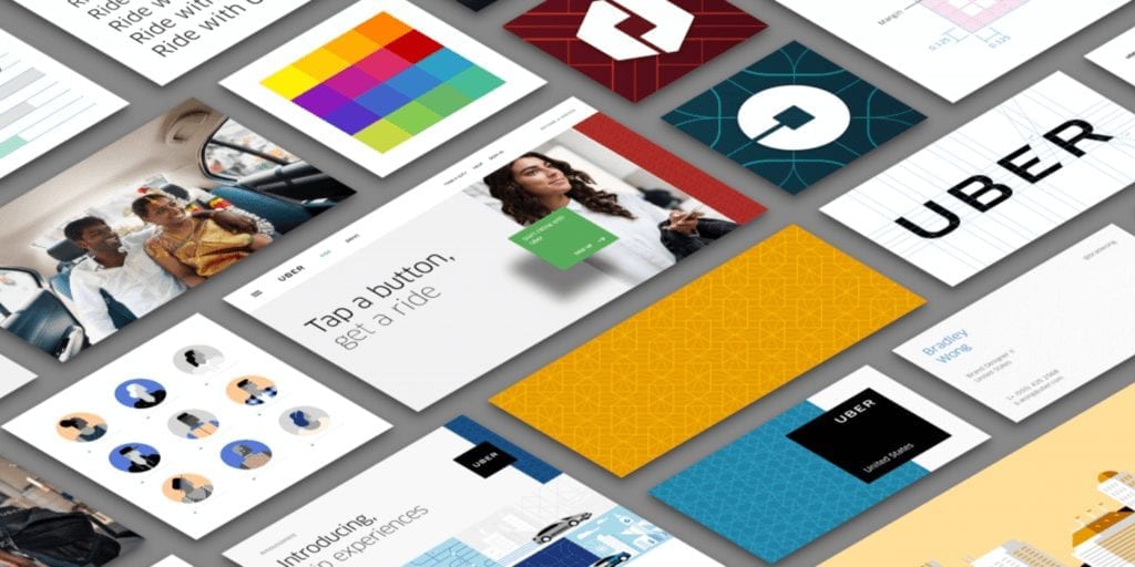
Uber logo and branding receives a nip, tuck and refinement

New year and a new look for the Uber logo. Their main logo receives a nick and tuck, with spacing reduced, letters thickened and refined. Bringing the letters closer together and thickening them up makes complete sense, it means it’s more easily read and identified at smaller sizes. “The first thing you’ll notice is that our […]

